
Creating a strong brand
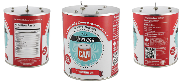
This is the design for the label of the Useless Can. We wanted to give the can the look of a real food can that you might find in a supermarket. The label is printed with the same quality that you would get on a real can. Our goal with the label was to liven up the can and give it more personality.
We designed the label to make it feel like a real one. The nutrition facts, ingredients, QR code and instructions are just some of the details that make this label appear genuine.
Future label changes
The current text on the can is meant for the Kickstarter campaign and is very humorous in tone. Eventually we will change the text on the label to be more helpful if it is sold in a store. There will be a few minor tweaks in the design until we start production, but this is close to what will be shipped to our Kickstarter backers.
The changes we plan to make right now are very subtle. Printing the label on this paper made some of the elements of the design less visible. Some finer details such as drop shadows are barely visible for instance. We will also rework the colors a little to make them more vibrant and appealing. We are also considering offering the label in different languages. Most people will not even notices these changes, but we want to make sure that everything is right, down to the smallest detail.
If you are interested by the Useless Can you can become one of our backers on Kickstarter.